For the second half of the module, we had to take what we had researched for the Research Book and produce a relevant response for it, focusing on a primary area of design and a secondary area complimenting it.
To be able to determine what I was going to focus on, I wanted to come up with some ideas before focusing it down.
 |
| Idea Generation Design Sheet |
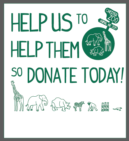
I came up with a few possibilities, with one being possibly a child's game to learn about the animals or by producing interactive information stations/tablets that could be around the zoo being worked through an app which could give an interactive walk through tour around the zoo. What made the most sense for me to produce however, based on the information involved in my research book, was a charity event to raise money for funds for the conservation projects that Chester Zoo are involved with. I liked the idea of having a family event which would be like a village fete around the zoo with stalls and activities throughout the day. From this, I brainstormed events I could have at my charity event as well as possible names, eventually coming up with 'Animal Aid' which I felt was straight to the point as well as being family appropriate. By deciding on producing a charity event, I went onto brainstorming collateral I could produce and propose:
- Tickets/ Wristbands
- Event Programme
- Money Donation Box
- Stickers/Badges
- T-Shirts
- Sponsorship Kit
- Raffle Tickets
- Posters
- Leaflets
- Food and Drink Packaging
- Bunting
- Petting Zoo Food Packaging
- Stalls
- Way-Finding
- Face Masks
- Advertisements
- Exterior Design
From this, due to the range of collateral I would be producing, I felt that I would be focusing my primary design area as Brand and Identity with my secondary focus on Product and Packaging.
When I had made these decisions, I had to write my own brief so as to give a defined record of what I was doing.
By writing the brief, it allowed me to have a focus and defined idea as to where I was going to go with this brief.
I decided that I wanted for my campaign was to be an integrated campaign to go with the current Chester Zoo brand so that it would be able to coincide together as, ultimately, this is for them and I liked the idea that they would be able to use this right now, currently.
 |
| Colour, Typeface and Logo Inclusion |
To go along with the current brand identity, I decided to go with the typefaces 'Indy Pimp' and 'Avenir Next' and colour scheme of green and white that I used for the research book as I had chosen those at the time for consistency with the current Chester Zoo brand identity. I would need to include the Chester Zoo logo within my work to show the affiliation with the Zoo but I will be using the inverted colour version that I used for the research book so it is not completely using the exact same. This will help with the production of my own brand for the event.
 |
| Logo Development |
I started off by having the Chester Zoo logo flanked by the event name 'Animal Aid' as if it has been stamped on but I didn't like the placement at all. It felt clumsy and unconsidered. I placed the text underneath the logo which reminded me of a swinging sign that can hang off it. I preferred this as it reminded me of a jungle expedition, however, I didn't like it in the same style as the Chester Zoo logo. I decided to adapt it to have an arrow on the end like a sign which automatically made a much better difference to the visual dynamic of the logo. The use of the arrow reminded me of the signage that they use within safari's and forests that tends to be upright and have arrows directing you where to go. I decided to apply this to the logo which made it much more original. The trouble was, however, that I needed to try and apply this signage logo to the purpose and cause of the event.
 |
| Logo Development |
To show the wide scale of which the charity works on, I decided to put the sign in a circle routed into it, using it as an reference to the global scale that the charity works on. The thought behind it I liked but I felt that it didn't come across very well. I decided that I needed to emphasis the cause more so I added the illustrations from the brand onto the logo. I decided to include a cross to show aid, relief and help within the circle but, if anything, it distracted from the rest of the design. I added them to the outside but felt that the logo might be too big so I decided to put them with the circle. This aided the sizing of the logo but I don't think this helped the actual message.
 |
| Logo Development |
The use for he cross in my development however gave me an idea. I thought that it would be nice if I would be able to visually show where Chester Zoo helps animals in the world by plotting it in the logo to see. I produced an illustrated outline of the globe and plotted where each of the 10 conservation projects are on the globe, using a cross to emphasis the relief they give. I put it centrally in the circle so that it is an integrated world view with the arrows of the logo showcasing the scale of the operation. I was very happy with this aspect because I was able to show the work that the charity does and why it is important for their donations without seeming needy and incorporating their logo successfully into mine.
 |
| Logos for Feedback |
Saying that, I wasn't sure whether the message behind this logo would come across successfully or not so I felt that putting the most successful logos together to get feedback would be good for the Crit we would be having.
From this list of possible collateral which I felt would be relevant to the event and the topic, I decided to start with producing the collateral which would needed to be crafted so that I would be able to make sure that they would work.
I started with the money donation box for the event as this would be the most important element of the event.
 |
| Attempt at Donation Box Net |
To start with, I produced a net for the box and crafted it to produce the net. This would allow me to see if there were any aspects to the net that needed to be included, such as extra flaps to attach it together with. I had decided that it would be a good idea to have a space in the middle in between the money section and the top so that it would be able to fit in badges or stickers which donators can have when they have put a donation in to show they have supported the cause. From this, I found that the sides were too high and it needed more flaps.
 |
| Donation Box Digital Net |
I took the success of the net that I had drawn out and crafted and put the measurements into Illustrator using the shapes tool, adding onto it the extra flaps needed so that it was more structured and the correct sizes of the sides.
 |
| Head of Donation Box |
I decided that I wanted a flap at the head of the donation box which will contextualise the box for the audience. I decided to include at the bottom where all of the donations were going to because I wanted to make sure that the donators knew that all the proceeds were going to the zoo and nowhere else. I used some emotive language to appeal to the donators to encourage them to donate and gave them a timeframe to encourage them to do it sooner rather than later as well as emphasising the day itself.
 |
| Unsuccessful Money Section Design |
I felt that it would be an idea to have an illustration on the section which would be upright where the money would be put in. I felt that I would be able to use the aid cross as to the section they put there money in so there was enough room to put coins through. However, I couldn't get the information to sit right on the space and, when I applied it to the net, it didn't do the box any favours. I have decided to not include this on the design as it wasn't very successful and didn't add to the impact of the box.
 |
| Donation Box Net |
From this, I printed it out and, again, crafted and produced the donation box to check on the net of the box and how the layout of the box works with the aesthetics. The box again needs some more extra flaps on it to the sides so that it is more secure where the donations would go. Also, the box comes across as quite plain on the outside so this would be something that I would have to develop. Another thing that has been brought to my attention is that the line work on the animal illustrations is very thick and this would be something I need to address.
The next thing I wanted to do would be to produce the masks for the children at the event as I felt that this would be something that would either be successful or fall down flat.
 |
| Animal Masks |
I started with a basic mask shape so that I would be able to fashion a basic illustration of a recognisable animals face onto, using it as a template so that it would for the contours of the face properly. I used some of the more recognisable animals from the conservation projects as the masks so that children would be more enticed by them if they would understand or realise what animal they are. I produced the masks in the colour scheme of the brand but I didn't think that it would be as fun or as recognisable for the target audience so instead, I added colour to them so that it reflected the animal that it was being which instantly gave them much more charm and fun.
Mask Mock Ups
I printed the masks out and put some holes in the side and tied it together with string so that it would fit around the users head. I printed both a branded one and a coloured one to see which would be more successful. To make sure that they would work in real life, I also tried one on for myself!
From this, I decided to work on producing the bunting that would be decorated on the stalls and on the buildings.
 |
| Bunting Shape |
I decided to have the bunting in the shape of a circle because then it would reflect the logo for the charity event. I wanted to have the circles in the bunting in alternative colours so that they would stand out amongst each other.
 |
| Bunting with Logo |
At first, I thought I would just have the charity logo in the bunting so that it would reflect the cause throughout the event but, in my opinion, it just came across as lazy and repetitive.
 |
| Bunting Development |
I put some of the illustrations within some of the bunting circles which instantly gave it a bit more personality but the circles still came across as being a little bit plain.
 |
| Illustration Bunting Development |
I decided to use a similar emotive language that I had used on the donation box with the bunting, except I decided to use some puns in regards to the corresponding animal and how it can help the charity with their funding. This instantly boosted the character of the bunting and made it much more personable.
 |
| Bunting Design |
With these additions to the design, it made it a lot less plain and much more fun which reflects the brand of Chester Zoo and reflects the intention behind the charity event.
 |
| Bunting Mock Up |
From this, I decided to produce a mock up version of my bunting to make sure that it would work in a practical, real world situation and I feel that the alternating colour scheme has really helped that. I decided to thread the bunting through with string so that it reflects the natural elements of Chester Zoo as well as being quite hard wearing so that, in real life, it would be able to stand being used outdoors.
From this point, we then had a Crit which I was able to show what I had done to this point and be able to get some feedback in regards to questions that I had about my work (See PPP Blog). Due to the fact that I was ill when the first Crit happened, it was integral that I got some feedback on my work. To help with the understanding of my project, I produced some design boards that would show the work I have done and where my project is going. Also, this would help answer some questions that I have about my project.
From the feedback that I got from my Crit, I decided to develop my work a bit further.
 |
| Chosen Event Logo |
I had been using the three logos I made on each different work so as to see which would work the best and, in the Crit, the one that was preferred was the logo with the crosses so I am going to use that as my logo from now on. One thing that was mentioned within my Crit and something that I have already considered addressing is the line work on the animals.
 |
| Development of Illustrations |
What struck me was that, due to the fact that the weight of the line was thin already, I couldn't physically make it any thinner so it was going to affect the visual aesthetic and outcome of my work regardless. Thats when it struck me that I could perhaps use the animals as silhouettes. I decided to get rid of all of the details of the illustrations so that it was just the original outline of the animal. I felt that this didn't work as well in white with a green outline as the outline made it seem a bit cheap. Instead I filled out the animals in full colour like a shadow silhouette and this seemed to solved the problem properly. I was very happy with this outcome and it helped instantly with the visual dynamics of the work.
 |
| Application of Illustration Silhouettes |
I went onto applying this aesthetic to the work I had already done and it was much better, instantly making the charity event have more of an identity of its own whilst solving the problem with the lines of the illustrations. I much prefer this aesthetic to the previous one.
Moving on from this, I went onto developing the aesthetic of the donation box because, when I had produced the mock up, it needed more of a visual aesthetic on the outside as well as some more secure structure.
 |
| Development of Net |
To start with, I developed the net so that it had more flaps to aid the security of the contents of the money box. Then I added the contents of the inside coloration to the box before taking the net and duplicating it so that I could start working on the outside of the box.
 |
| Developing Pattern |
I decided to see if I could use the illustrations of the animals to produce a pattern on the outside of the box. The problem with this is that, as a repeating pattern, it doesn't look very professional with large gaps of space.
 |
| Pattern Development |
Due to the large amounts of space, I decided to re-arrange the placement of the animals so that they were much closer together and not in a line. This closeness allowed for them to be much more condensed and have less space surrounding in the pattern. I applied this to the background but found there was still some areas which didn't fit in well so I added some of the animals into the spaces left over which instantly gave it the impression of being a cohesive continuous pattern. This worked really well and gave the box more of a personality.
 |
| Application of Pattern |
I went onto applying this pattern to the sides, top and inner sections of the net, changing and alternating the pattern so that the animal faces the donator the right way up, however, I wasn't sure whether this might be a bit too much.
 |
| Donation Box Net |
I decided to print off the outside of the net to make sure that the way that the animal pattern has been laid out so that the animals were the right way up as well as making sure the actual pattern was successful. I was worried that it might have been too much to overwhelm the box but, actually, it fitted it very well.
The only problem now with the pattern was the overwhelming amount of the same colour for the box. I liked the pattern and the shape but I felt that the green shade of the colour scheme needed to be broken up a bit.
 |
| Tints of Colour Scheme |
 |
| Application of Tint Colours Pattern |
After the success that I had with the poster brief that I did where I worked with tints, I decided this would be a great opportunity to expand on it and work with tints again. I made a range of 8 colour tints from the main brand green and started to apply them to the animals. I decided to keep this down to only as few animals because the amount of colours would otherwise become overwhelming but I added some of the tints to some of the more distinctive animals. The pattern came across very successfully when applied to the outside of the money box and allows for the charity event brand identity to have much more of an individuality compared to being exactly like the identity of Chester Zoo. I have been fighting with this problem through this brief and I feel this development I have done has made a huge difference which I am very happy with.
Having produced the donation box, it was only right that I went onto producing the stickers that would be given with it.
 |
| Stickers Experimentation |
Originally, I thought it would be nice to use the bunting as stickers, using the circles as the shapes of the stickers so that it goes with the rest of the brand identity. With that however, I felt that the amount of text would be difficult to read at such a small scale so I decided to take just the logo bunting and use that as stickers. I felt that this would be a bit boring and I wanted to make the stickers more individual so felt it would be nice to have a different illustrated animal within the stickers. From this, I started playing around with the tints of the green both for the animals and the circles of the stickers themselves. I liked the use of the tints of the stickers but I didn't like the individual animals for the stickers.
 |
| Sticker Development |
From this, I decided to experiment with having a number of the animals onto the stickers. I felt that the larger the amount of animals I put on the stickers, the more successful the stickers were looking. In the end, I put the full pattern onto an A4 and put some circles over the top so that it would be easy to cut out and reproduce.
Happy with the donation box, I decided that this pattern I have produced would work very well on a poster design.
 |
| Poster Layout and Pattern Development |
I took the pattern and put it in a box with the logo of the event at the bottom corner so that I would be able to judge how much space there was. The problem with this was that the pattern came across as being very confined within this space. I expanded the scale of the pattern and got rid of the box so that it was much more freeing. I felt that this would work both as a white and a green background so I decided to flip the pattern so that the green animals were white. This was successful as well as both the green and the white posters would work as a series but would work individually as well.
 |
| Layout Experimentation |
In regards to adding any information onto the design, I played around with how I should lay it out, experimenting with placement and size of the information as well as what to include.
 |
| Final Layouts |
I decided that it would be best to base the layout on the principles of information hierarchy and felt that this would be the best way to lay out the information. Happy with this, I applied this layout to the green poster as well but used whit text rather than green for legibility. This design would work for large posters as well as on a smaller scale as flyers as well.
In regards to the event itself, it made sense to try and think of some events that could happen for the charity day and put them into an events programme so that all of the attendees would know what was going on and what they can be doing during the day.
 |
| Front and Back Cover |
Due to the fact that small scale text would be easier to see on a white background then a green one, I decided to have the inside of the event programme in white and the outside in green. I used the poster design for the front cover and put the logo on the back cover so as to keep it as simple as possible with the front cover being so strong.
 |
| Inside Event Programme Development |
I felt it was best to have all of the information in regards to the events split into sections, having the activities name as a header. I had the information put into short paragraphs so that they were easily readable. I wasn't sure what to have on the opposing page so I felt it might be an idea to describe the point and reason as to why this event is taking place. I started playing around with the layout of the programme but felt that I hadn't put enough about the purpose of the day so I added some more information and had it separated on both sides. The problem was that the text was very much condensed and difficult to look at or read altogether. I felt it was necessary to break the information up so I decided that it would be necessary to change the body copy typeface to make it easier to read. I used 'Avenir Next' as this is what I used for my research book and instantly made it much more legible and easier to read.
What I hadn't considered yet was the way of people getting into the event so I knew it would be relevant to produce some tickets for purchase and some wristbands for entry.
 |
| Perforation |
For it to be like a genuine ticket, I would have a main side to keep but the other side would be a side which would be torn off on entry so I split this through the line down a fifth of the ticket. I thought that this could be perforated so it could be torn off like a proper ticket. I felt it would be an idea to do both a green and a white version to see which would be more fitting.
 |
| Procession Inclusion |
I liked having the procession of animals going along the bottom of the tickets but when reflected in the tear off side wouldn't fit properly so it didn't fit right. I decided not to include it as I felt that it didn't add to the overall aesthetic.
 |
| Logo Placement |
The placement of the logo was quite difficult because originally I had wanted the perforation side and the normal side to be as reflective of each other as possible but I realised that this wouldn't work and that I should take the sides as two separate layouts, working on making them the best separately so that it is cohesive through its connection together instead. taking this approach made it easier for me to work out the best placement which I was happy with.
 |
| Ticket for Event Development |
After this, I had to consider the information that I was going to include on the tickets and how I would place it. I decided to keep both the green and white tickets as they seemed both successful so I decided to have one as a child ticket and the other as an adult ticket. I was going to have the information in the centre of the ticket but I found that it would leave little room for anything else so I ended up moving it further to the top. On the opposing side, the information is much more minimal and confided to the top and bottom for ease and information hierarchy.
With the tickets and wristbands being connected to entry, I wanted them to reflect each other and work together.
 |
| Wristband Colours |
Again, I went for one for each colour so adults and children would get one each. This would aid what they would be permitted to do during the events day as well.
 |
| Wristband Landscape Design |
For the wristbands themselves, I knew that the long landscape format would make it difficult to produce a fitting design because it would have to be elongated or stretched out. I decided that the best way I would be able to do this would be to make the pattern smaller and duplicated. By duplicating the pattern several times I was able to gain the length that I needed without stretching it, instantly making a very successful landscape design that fitted the length of the wristband. I did the same for the other wristband.
 |
| Wristband Information Placement |
Again, I had to work out which would be the best placement due to the landscape format so I originally started with a landscape format for the logo and the information. However, this looked very poorly executed so I made it much more vertical but again it would not fit onto the space of the wristband. That was when I decided to split the logo and the information in two which instantly looked much more considered.
The next thing I felt would be important to the event would be producing a sponsorship form as that is the reason for the event in there first place. I decided that I would produce a form with a letter of thanks and a file to package them in.
 |
| Room for details |
The main thing I was concerned about when working out how I was going to do the sponsorship form was the amount of room I was going to leave people to fill in their details and how I would indicate that they should do this. The use of a line seemed very plain so I felt that a box would be better, especially as it would be more spacious for larger amounts of information. With that I put it next to the information indicators but that seemed to take away from the amount of room as well as seem disjointed as to where it started. Instead I put the boxes underneath so that there was an equal start and end positions which was much more specific and even. The header at the top of the form is in keeping with the rest of the branding of the event.
 |
| Sponsor Animals |
Using the conservation areas and the animals which are within them, (apart from the UK conservation area which is more general and works more on the surrounding countryside and locations) I imputed animals which the sponsor could choose to sponsor and had circles next to the name for which they could indicate their interest. I wanted circles so that it reflected with the brand identity's use of circles.
 |
| Added Information |
I settled originally with just having the person sponsoring just signing their agreement but then I realised that that wouldn't indicate that they would know that they would be paying for it so I added a sector for method of payment as well as an area for whether they had read the terms and conditions which would be told to them as they consider sponsoring. I felt that this was important information to include so I changed the positioning so that the last thing they did was sign their agreement.
 |
| Thank you letter |
For the thank you letter, I wanted to keep it simple and in the same layout as you would a normal letter however, I wanted to keep it personal by having the animal they have adopted thanking them as well which I thought was quite sweet. I kept the sponsorship form and the thank you letter in white so that they could be printed several times and not amount to using too much ink for the company.
 |
| Inside and Outside Net |
I went onto producing a net for the file for the sponsorship form which would be keeping all of the information together. Using this net, I went onto putting it into colour as I felt that it was too plain in white. For the inside, I decided to use the pattern for the inside so that it acted like a reminder to the donor as to who they were helping.
 |
| Front Cover of File |
Reflecting the brand identity, I put the animal procession at the bottom and the logo in the top corner. For the writing, I wanted to try and think of something similar to what I had put on the bunting so that it was witty but I felt that the subject matter was too important for that so I decided to go for something that was much more emotive and powerful, playing on how they can help and make a difference.
With these things being of importance to the fundamental important aspects of the event, I wanted to start to focus on the activities of the events programme, starting with the raffle tickets book for the animal naming contest.
 |
| Layout of Raffle Tickets |
I left a gap of about 1 to 2 centimetres to accommodate for binding on an A5 size page and used the rest of the space to split the page up equally into room for raffle tickets.
 |
| Ticket Layout |
I started off with having the text at the front indicating that they should write their response at the back of the ticket but then I thought that t would be pointless to do that so I decided to accommodate some room at the front for the information to be put there, using the same layout as the sponsorship form.
 |
| Raffle Tickets |
From this layout, I decided to change the colour of the background so that it was white which would make it easier to read the responses given by anyone who takes part.
 |
| Front and Back Covers |
I made a front and back cover for the book which I made a little longer on the sides so that I could accommodate for the binding.
The last thing I wanted to produce was some packaging for the petting zoo feed that children could use to feed the animals with.
 |
| Packaging Mock Up |
I wasn't sure how I would be able to produce some packaging for it as I felt it would need to be quite big. I had considered having the packaging as a bag that you could fold over but this might have been quite bulky for small kids. I decided to go with a small folded packet which would be small in size so that it would be easy for children to handle. I produced a small mock up of the package so that I would be able to work out the sizing of the package and how it would fit.
 |
| Petting Zoo Food Packaging |
I put the dimensions into Illustrator and added a front cover onto it using the same brand visual identity. I produced one in both green and white so that I could accommodate for the different types of animals that would be there in regards to their food type. I then connected all of the sides together and united them into one shape so that they would print without the lines.
From what I had designed, I printed it onto the same recycled A3 off-white card that I used for the front and back covers of the research book. This way there would be some consistency whilst it would stick with the ethos and sustainability that is urged through the conservation work.
 |
| Crafting of Work |
I cut out what I had produced using a craft knife and crafted the 3-D elements like the money donation box. I took what I had learnt from the research book by putting what I learnt about perfect binding into creating my raffle ticket book and I even had the chance to use a perforator for the first time for the raffle tickets and the event tickets which didn't go very well but I felt that it gave them a little more consideration.
 |
| Photographing Work |
I took a range of photographs of the collateral that I had produced, showcasing the extensive range that I had managed to produce. I hadn't realise how much I had considered until I had laid it out in front of me.
 |
| Manipulations on Photoshop |
 |
| Photoshopped Images |
I put the photos that I had taken into Photoshop and changed the settings to make the images clearer and of better quality, enhancing the Levels, Colour Balance, Brightness and Vibrancy as well as cropping and straightening the images. I have made this an integral part of my design practise to do this as it adds to the quality of the final outcome.
To coincide with the collateral and products made, I produced some brand guidelines that would work for the charity to work from.
This way, anyone who would be working on the event would understand the reason and purpose behind the event and how it should be presented.
These have got to be one of the most professional layouts I have ever produced for some design boards so I am very happy with them. I spent quite a bit of time producing the layout and text for the boards as this is something that I generally find the hardest to do but, based on the design board workshop we had, I had put extra emphasis on the smaller things such as the spacing in-between the images and the information as well as what information to include on the boards themselves which I think has defiantly helped the professionalism and the presentation of the information.
It was at this point that my laptop broke an hour and a half before hand in while I was producing my boards. This was perhaps one of the most nerve-wracking moments of my life due to the amount of effort, hard work and stress that has gone into it. Thankfully, one of the tech guys in the computer room managed to fix my ram clips and save my work which I am so thankful for. That meant that I got the opportunity to add my images on my boards just in time.
If my laptop didn't break down, I would have had time to perfect my images for the design boards, however, generally I am very happy with how they came out as it shows a collective range of the work that I produced.
Overall, I found this brief much easier to get into and get involved with then I did with its first studio brief counterpart, particularly when I had found my own identity for the event within the Chester Zoo existing identity. This defiantly cemented what I have learnt about this year which is that I like doing brands and producing a cohesive identity for them. In a way, I am glad that I have realised this because I feel as though I have found what makes me happy in design even though this wouldn't stop me trying other things.